Today, we’re talking about two events that have the design community tweeting: Teenage Engineering’s medieval sampler and the Allan Peters logo redesign controversy. Let’s get into it.
Medieval times at Teenage Engineering
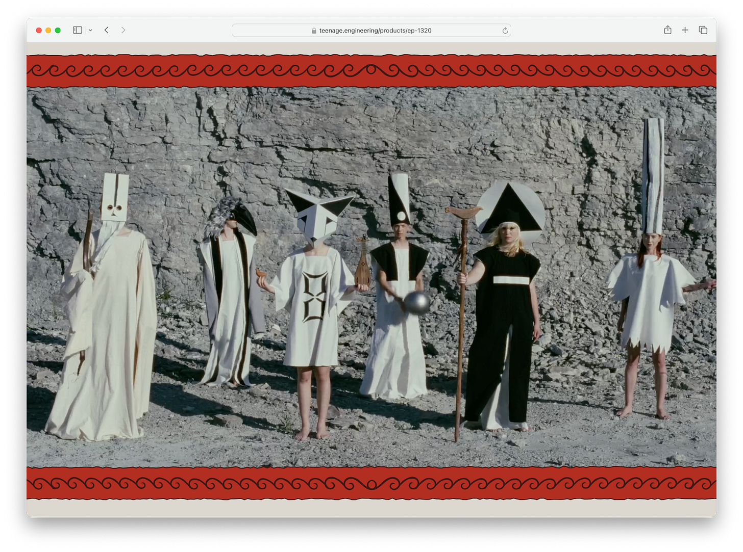
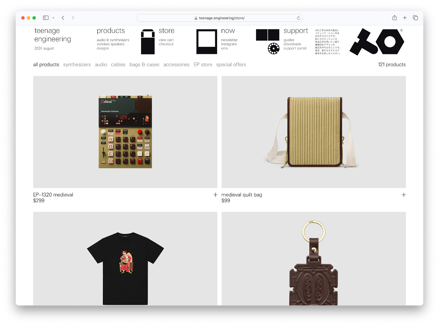
Picture this: You’re strolling through a Renaissance faire, dodging turkey legs, when suddenly you stumble upon a synth booth. That’s the vibe of Teenage Engineering’s new EP-1320 Medieval Sampler. This “world’s first electronic medieval instrument” is peak Teenage Engineering: niche, beautifully designed, and utterly unnecessary.
From the incredible marketing materials to the add-on quilt-bag, every detail is perfect. It’s the product line no one would ever think to ask for, but an instant add-to-cart. (Note: predicted a medieval revival in April.) They went deep down this rabbit hole, and emerged with a product that is undeniably them. The real question is: Will anyone actually use it?
Teenage Engineering has perfected the art of making their main gig feel like a dreamy side project that accidentally turned profitable. They design for themselves, scoff at user testing, and have cultivated a following so cult-like it makes Apple fanboys look casual. It’s a shtick, sure, but it’s a shtick that sells.
The logo redesign that launched a thousand hot takes
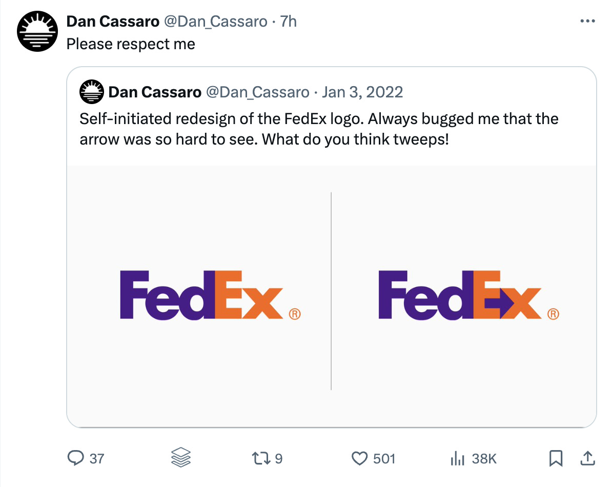
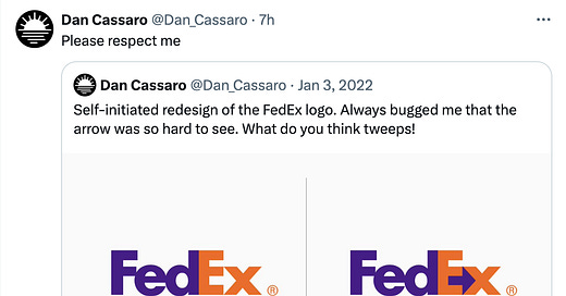
Now, let’s swivel our ergonomic chairs to the other end of the design spectrum. Enter Allan Peters and his controversial logo “fixes.” An article criticizing Peters’ work ignited a firestorm in the design community. The debate? Whether these redesigns are valuable exercises or just clickbait masquerading as design work.
Brand New co-founder Armin Vit argues that Peters is designing in a bubble—“no client, no deadline, and no real-life challenges.” Peters, operating from Minneapolis, represents the ‘everyman designer.’ His premise of logo riffs may feel reminiscent of a student project redesign, but they’ve built him a following and landed him several clients. It’s cringe to some, inspiring to others, but effective as personal brand strategy.
The double standard
And yet, the same design elite that scoffs at Peters’ context-free redesigns fawns over Teenage Engineering’s context-free products. Both operate in bubbles, divorce from market demands or practicality. So why the double standard?
Is Peters’ crime simply that his shtick is too accessible, too “basic”? Is it that the work is bad? Or is this a classic case of design classism, where the cost of entry determines the value of the idea?
Obviously there’s more at play. A medieval synthesizer is delightful. There’s world-building and incredible execution. There’s originality and a high-level of craft seen in the product itself, as well as website and video. There are Gregorian chants and “bubonic beats.” There is humor. There is also taste, which notably, is not typically a line item on the brief for a corporate logo redesign. It feels fresh and unexpected.
The difference between a bit, a shtick, and a meme
Kamala is brat and Tim Walz is our dad (memes). Vance and Trump are creepy and weird (a bit?). Teenage Engineering releases highly niche hardware and Allen Peters “fixes logos” (a shtick?). Memes might not be able to bring down the government, but they sell merch and a good shtick might get you your next job.
Online, these concepts can overlap. One person’s temporary bit might become their shtick, which could then evolve into a meme if it becomes imitated/remixed by others.

Scroll your feed, and you’ll find countless shticks: subway interviewers, neighborhood explorers, boys’ room investigators, music taste interrogators. There is the balloon man and dude with sign. Designers are uniquely good at coming up with a good shtick. Some of my favorite shticks, or side projects with main-project energy include:
Soren Iverson’s unhinged app mockups
Nicole McLaughlin’s clever upcycled fashion
Christoph Niemann’s everyday object doodles
Pablo Rochat’s entertaining pranks? vignettes?
These projects couple craft with commentary, pairing the ordinary with the uncanny or unexpected. They provoke thought. They have a unique voice and a distinct point of view—substance and style. As Bonnie Kate Wolf puts it: “If you want engagement, redesign. If you want respect, design.” Peters’ logo redesigns, by contrast, explore the narrow idea space adjacent to reality. They repeatedly take the existing, explore what could have been, and propose it as a hypothetical solution. They’re an exercise in iteration and “reimagination” perhaps, but not invention. They’re practice.
So, when does a shtick become a sellout?
30 days of type. Of dating. Of creativity. Of making tiny food out of clay. The premise lies in repetition over a limited period. These projects teach us things, provide constraints, and often result in some form of social content. But where’s the line between practice and self-promotion? Between a side project and a sellout? Is it when they enter the public eye? When value is exchanged? Can good work and a posting strategy be enough? Is anyone allowed to be cringe on main? Is a shtick just another word for personal brand, or is it the point where authenticity goes to die?
Perhaps the answer lies not in rejecting the shtick entirely, but in infusing it with a point of view. Originality. There’s nothing wrong with designing in a bubble for a bubble, but once that work leaves the bubble—buckle up, baby. Prepare for feedback.
Teenage Engineering’s medieval sampler, for all its nicheness, offers something beyond mere gimmickry—it’s a tiny, joy-filled universe that encourages others to participate (we’ll see if they do). There’s craft, humor, and taste. In a world drowning in stuff, maybe that’s the challenge: if you’re going to have a shtick, imbue it with such creativity, originality, and care that it transcends the label.
—Carly


so good Carly! Thankful for your smarts!
absolute banger so many gr8 points