What even *is* a website?
Nick Jones on creative partnership, experimental interfaces, and why we may still be in the silent film era of the web
“We do not yet know what a website is and need at least another decade to figure it out,” tweeted Nick Jones. Whether provocation or shitpost, it caught my attention—especially coming from someone who’s been defining the bleeding edge of the web for the past two decades.
Working alongside designer Devin Jacoviello at Stripe, Nick crafts digital experiences that push beyond conventional web design, from immersive 3d globes and books to portfolios and vortexes that spin as you scroll. I caught up with Nick to talk about why he considers the web a medium in the making and what it might take to push it forward.
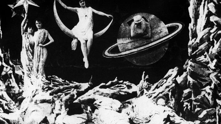
The web’s George Méliès era
Nick believes we’re still in the early days of the web—not just technologically, but creatively. His analogy: we’ve had 150 years to figure out what a movie is. The Lumière brothers filmed a train pulling into a station in 1895. It wasn’t until 1939 that The Wizard of Oz and Gone with the Wind hit theaters.
“We’re 30 years in,” he says. “And I can’t say, ‘Oh, these are the great websites.’ Those don’t exist yet. The web’s Citizen Kane hasn’t emerged.” We’re past the train-pulling-into-the-station phase, but we’re not yet in color or sound. Maybe we’re in the Méliès moment—pulling rabbits out of hats, experimenting with camera tricks, but still figuring out the language of the medium.


Part of the problem is metaphor. We’re still importing models from legacy media, even as the technical capabilities of the web expand. The “desktop,” the “page,” the “homepage.” But what if we started from scratch with forces native to the web, such as time, movement, depth, interaction?
One long conversation
Nick’s best work has emerged from an ongoing dialogue, not briefs. Specifically, a continuous, years-long back-and-forth with designer Devin Jacoviello. “There’s really no separation between the talking-about-it, the figuring-out-what-it-is, the making-it, and the improving-on-what-we’ve-made,” Nick tells me.
Their projects are timestamps along a shared creative arc. “They’re a collage of whatever we were texting, reading, or exploring at the time,” he says. They start from intuition, shared references, and an openness to follow weird ideas where they lead. “He fights for my wildest ideas, and I fight for his,” Nick says. “So neither of us has to.”
That mutual defense of the weird creates space to let the idea become what it wants to be. “The longer we can wait to lock down what it is, the better chance we have of actually making something that breaks new ground,” he says.
Inside a website that is also a donut
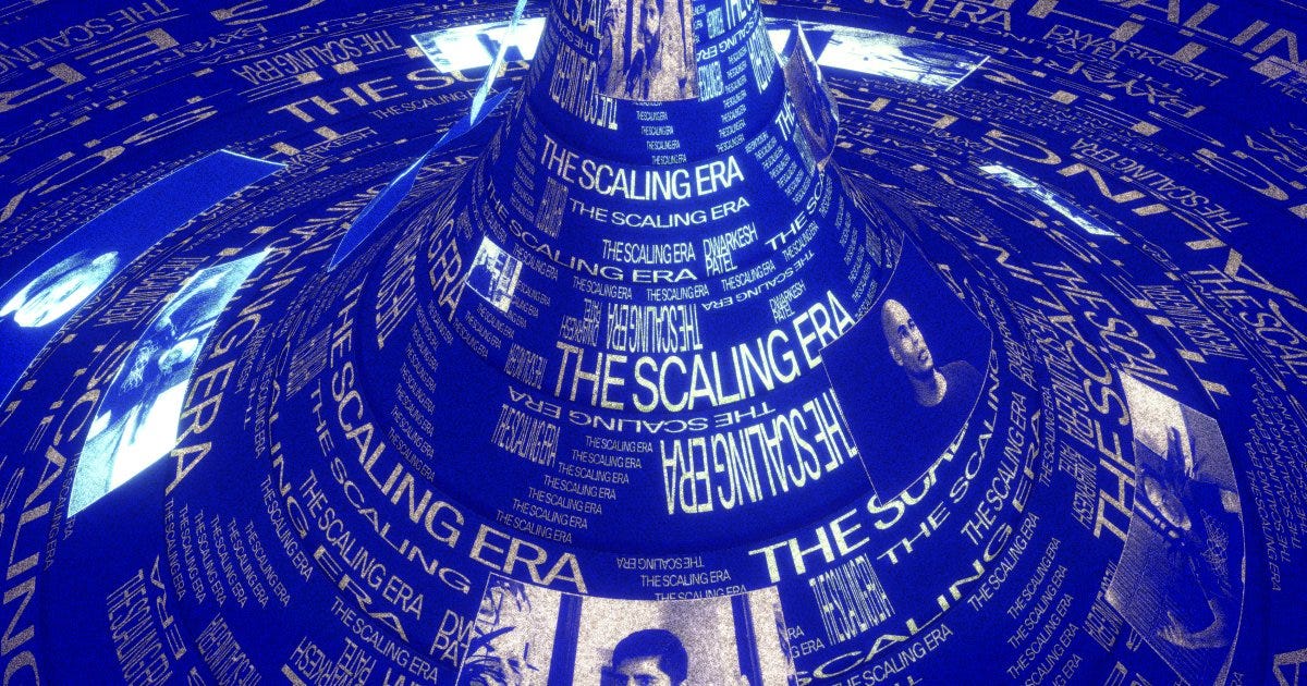
Their recent website for The Scaling Era, a forthcoming Stripe Press book about the recent history of AI, exemplifies their fluid approach. The site opens into a swirling, scrollable field of data, like standing inside a fusion reactor that’s both absorbing and emitting information. Scroll down, and content is pulled inward. Scroll up, and it expands outward.
This concept grew out of a series of conversations with designer Leigh Taylor and a recommendation from Jacob Thornton: Liber Indigo, a speculative book about reimagining interface metaphors beyond the desktop. One idea stuck: what if you wrapped a table of data into a radial dial, looping rows like the zodiac? Nick and Devin pushed it further: what if you also wrapped the top and bottom of the dial to form a full loop—a donut? As Nick describes it, “You could rotate it on two axes: a toroidal axis, like turning a steering wheel, and a poloidal axis, like spinning a dial.” A simple scroll could set the entire structure in motion, transforming static information into something spatial, tactile, and alive.
Once they had a working prototype, Nick and Devin shared it with the Stripe Press team—producers, editors, and the author. They loved it. With their support, and another week of iteration, the donut evolved into a full interface. Scrolling in either direction created the sensation of information being pulled into a vortex—or expelled outward by a powerful force. “We liked that it made us feel small,” says Nick. “Like we’re interacting with something really powerful—something you don't normally experience on the web.”
Make the thing to do the thing
Their work might bend the limits of the browser, but I’m just as impressed by how they bend the rules of bureaucracy. In most large organizations, ambitious ideas get softened into oblivion—over-explained, over-reviewed, and slowly chamfered into something safe. Often, they die in a deck. Or worse, they ship unrecognizable.
So how do they keep the weirdness alive? Mostly, Nick disappears into code, while Devin does the talking.
“Every project is different,” Nick tells me, “but generally, during a random conversation, one of us says, ‘What if we tried applying this really stupid thing we just heard with that funny idea from last month?’ We get excited, and either I prototype something hideous or he designs something wild to try the idea out. If he sees potential in my prototype, he makes it look great. If I see potential in his design, I try to bring it to life in a prototype. If there’s nothing special, we get distracted and abandon it—until it randomly becomes relevant again or doesn’t.”
It’s a messy, improvisational approach. And that’s the point. For them, prototyping, designing, pitching, and questioning ideas aren’t distinct stages of a linear process—they’re happening all at once. Design is the process. Prototyping is, too. The web is tactile, spatial, temporal. You can't describe a feeling into existence. You have to make it first, just to know how it feels to use.
“There’s often pressure to be specific about what we’re going to make and what it’s going to be like when it’s done,” Nick says. “But that forces us to reduce the set of possibilities to a few that are easy to imagine—and to explain to someone who may have limited experience with experimental interfaces. Even if they’re an expert, they’re definitely imagining something different than we are.”
That reduction can make an idea easier to approve. But it can also kill the thing that made it worth making. Instead, Nick and Devin resist premature certainty. They build first, find the feeling, and only then begin to explain. It’s a design approach that feels less like product development and more like jazz, but one that’s led to some of Stripe’s most distinctive web moments.
Prototyping everything
With a background in industrial and brand design, Charlota Bunarova has prototyped everything from personalized skincare startups to luxury retail experiences (including one made entirely of IKEA furniture). She speaks on rough drafts, sacrificial concepts, and designing your way through uncertainty.
The opportunity ahead
Much of the web is optimized for transactions and scrolls, while little of it is designed for deep engagement. Nick posits that the best uses of the web may not come from new ideas, but from old ones, retold through new forms. “Plato’s website should be good,” he tells me. “But it doesn’t exist. Why doesn’t that guy have a website?”
A PDF isn’t a translation—it’s a compression. But what if we treated Plato—or Simone Weil, or Audre Lorde—with the same level of design craft and attention we give startups? “If you could transmit the knowledge from the great philosophy books into people’s brains through some sort of interactive experience, that would be a meaningful contribution to humanity,” Nick says.
For designers looking to push boundaries, Nick offers this: the web’s finest works haven’t been created yet, which means everyone has the opportunity to help define what this medium becomes. “There’s no rule saying you can’t be the one to do that.” By naming what we don’t know, we make room for what we haven’t yet imagined. So: what even is a website?
If you’re Nick and Devin, it’s not a homepage. It’s not a container. It’s not something we’ve figured out yet. And that’s the most exciting part.
—Carly
P.S. You can catch Nick and Devin speaking at Config London May 14. I’ll be tuning in virtually, and rooting for my Figma friends in the lead up!


I’d love to do this donut style of engagement with our website for our artists…
Pretty much what is said here: https://koomen.dev/essays/horseless-carriages/ in the difference between system and user prompts.